Case Study - Animation
A two-part animated series and accompanying educational resources, designed to raise awareness of the potential risks associated with internet use. These materials were designed to support workshops delivered by sixth-form mentors to younger students, helping to encourage safer and healthier habits when using the internet.
WHAT WE WERE ASKED TO DO
The brief.
We were approached by the Digital Literacy for Young People Programme at UCL and asked to produce a series of animations with supporting learning materials. These materials were going to be used as part of peer-to-peer mentoring sessions that would help demonstrate the dangers associated with using the internet to young people, encouraging them to think critically about what they are seeing online. One of the most important considerations for this project was the age of the audience; it was important that the videos felt contemporary and engaging to grab the viewer’s attention. However, it was also critical that the messaging did not feel too negative or pushy, as research suggested that teenagers are already aware of many of the dangers of using the internet, and are fatigued by being constantly reminded of them.
Project deliverables:
2 × 90-second animations
Teaching materials - PowerPoint presentation
Information sheets
Report document
Editable questionnaires
Logo set
A reusable asset bank
INSIDE THE PROJECT
Our approach.
We had a series of conversations with the client to establish the visual style they wanted to achieve. We really took the time to fully understand both what they were looking for and also the approaches they wanted to avoid. During these early conversations, we shared a range of reference videos, which helped us identify a clear direction: a bold, attention-grabbing style that conveyed a sense of urgency while remaining engaging for young people.
During this stage, we were particularly inspired by the 2025 Spotify Wrapped campaign. Its clean, contemporary aesthetic and strong appeal to younger audiences reflected many of the qualities we wanted to achieve in the Digital Literacy project. The campaign's confident visual language - bold gradients, expressive typography and fluid motion - aligned closely with the aims of the Digital Literacy project, communicating clarity, urgency and accessibility in a way that felt fresh and relevant.
Animation
It made sense to begin the project with the animation. Once we had established a visual style that the team was happy with, we could carry it consistently across the learning materials.
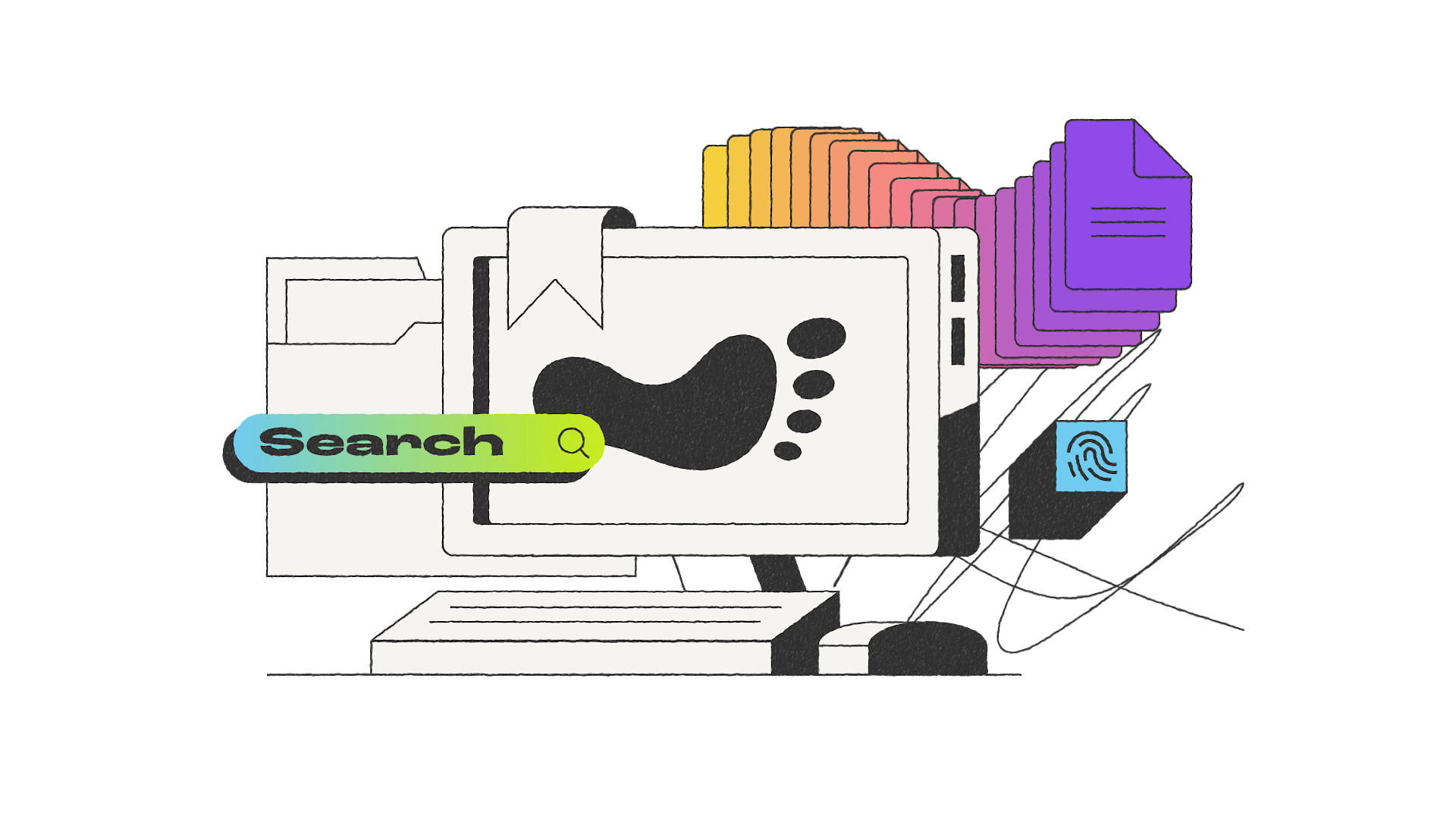
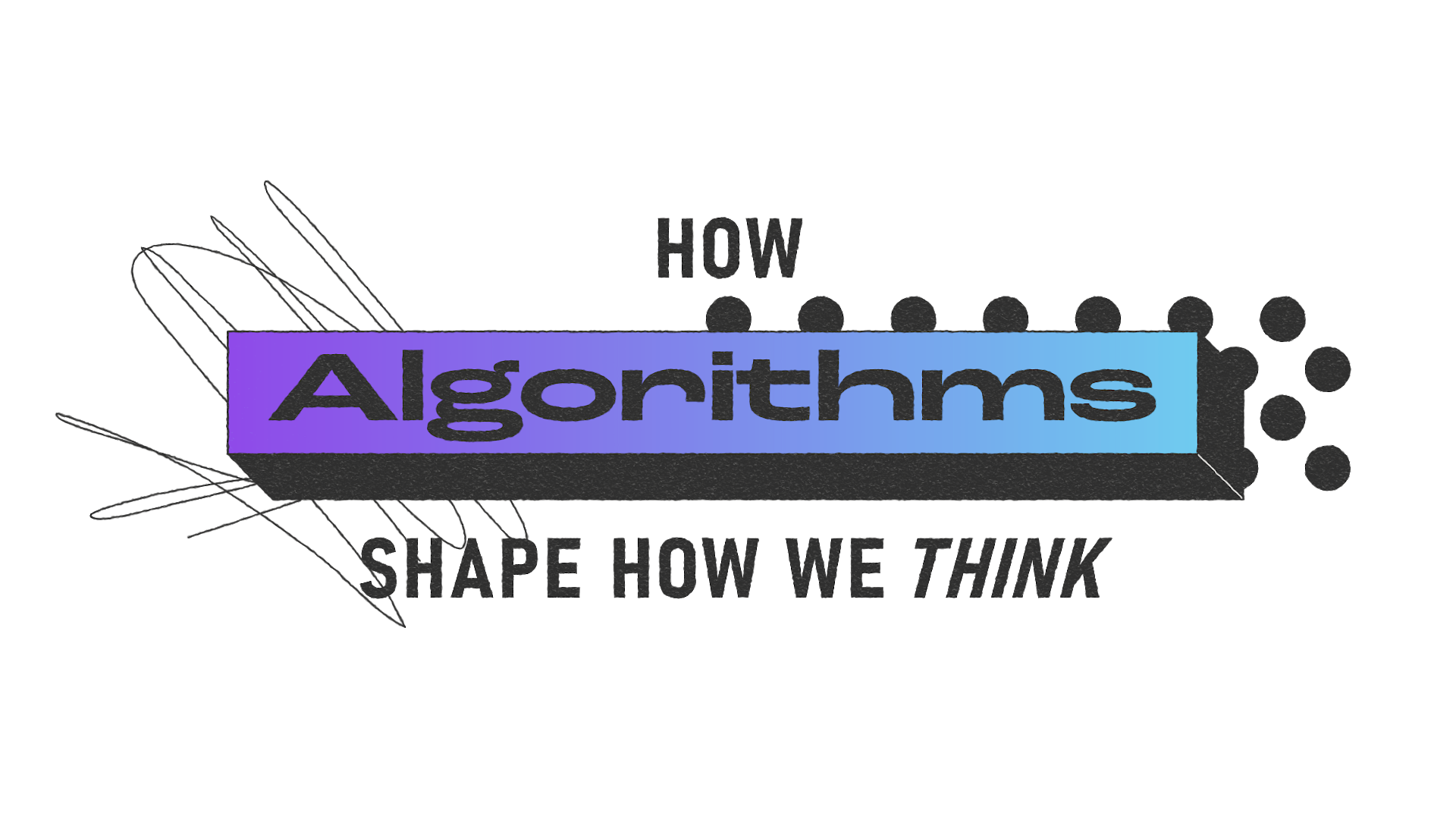
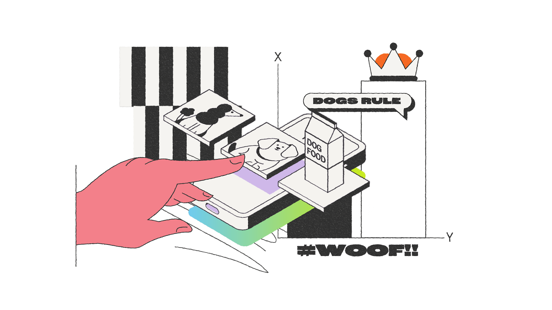
We brought our friends at ink on board to lead the animation, resulting in two bold, punchy explainer videos that combine hypnotic visuals, retro-inspired motifs, striking gradients and grungy textures. Together, these elements create a distinctive aesthetic that captures attention while reinforcing the important messages. The finished videos encouraged viewers to pause and think more critically about the digital content they consume.
Voiceover
We produced guide voiceovers using the draft scripts to test how they sounded in practice. Hearing the scripts aloud helped us identify awkward phrasing and pacing issues that weren't obvious when reading them on the page. This process allowed us to refine the wording before briefing a professional voiceover artist
After reviewing professional voiceover samples with the client, we selected Ritchie Clark as the most suitable option as his tone felt the most engaging and appropriate for the target audience.
We briefed Ritchie to deliver the script in a clear, conversational and human way - informative without feeling corporate or instructional. We suggested that the overall tone should feel curious, reassuring, and calmly serious when discussing topics such as misinformation and AI. We wanted the narration to feel like a trusted older peer sharing observations rather than an authority figure, with a natural voice and a subtle, friendly Yorkshire accent.
Music and sound design
We went through several iterations to find the right music for the animations. We worked closely with the client to strike a balance between creating a sense of urgency and ensuring the soundtrack didn't distract from the narration. In the end, we produced versions both with and without music, allowing the client to choose the most appropriate option. For the final workshops, they selected the version without music to keep the focus on the narration.
We also added sound design to support the animation, using subtle sound effects to reinforce key visual moments and bring the visuals to life. The final mixes were carefully optimised by Eddie Dobson (Fine Line Audio) to translate well across a wide range of playback contexts - from phones and laptops to classroom systems and professional monitors. This ensured the narration remained clear and the music, when used, sat comfortably beneath the voice rather than competing with it.
Building a visual identity
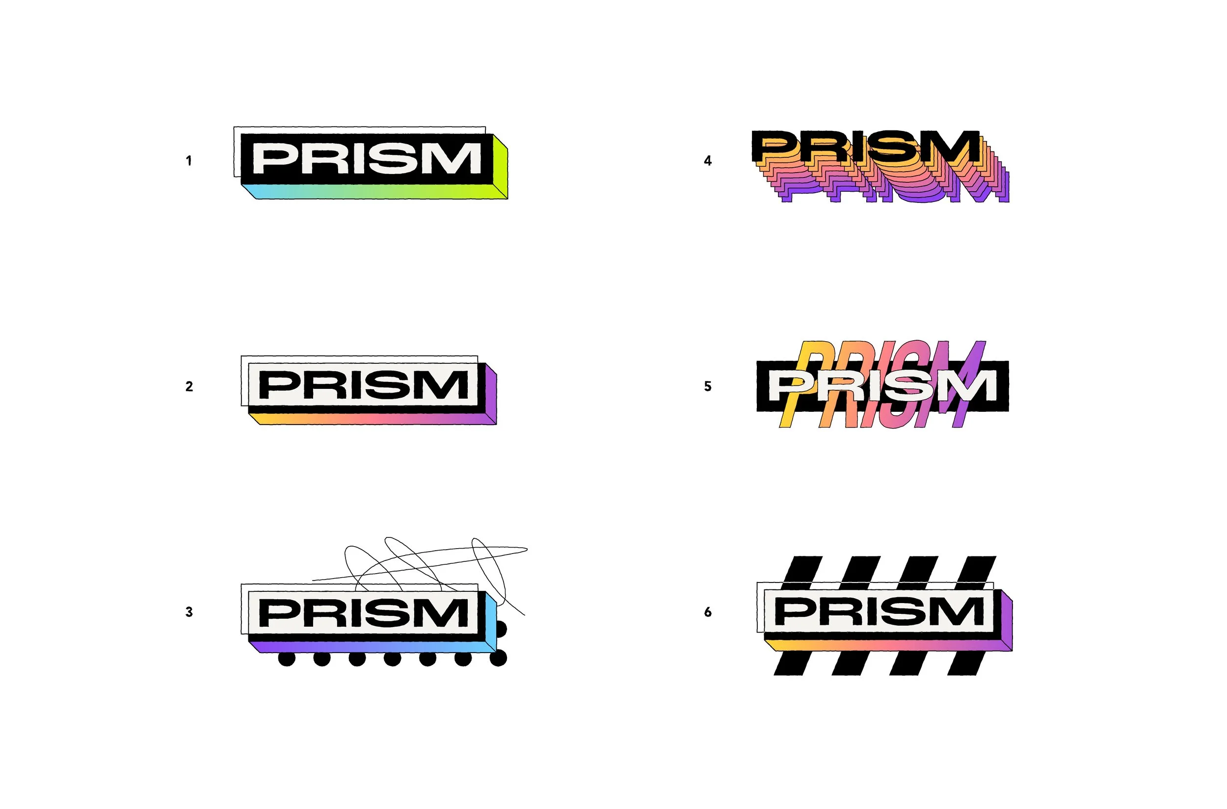
Once the animation style had been established, we expanded it into a cohesive visual identity for the wider project. The team from ink designed the Prism logo. They explored several logo directions before refining the final mark. The chosen design draws on the idea of a prism refracting light into different perspectives, reflecting the project's focus on questioning information, seeing beyond surface-level narratives and encouraging discussion between peers.
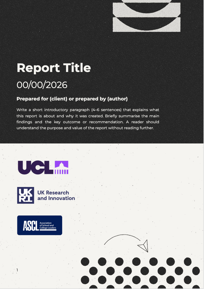
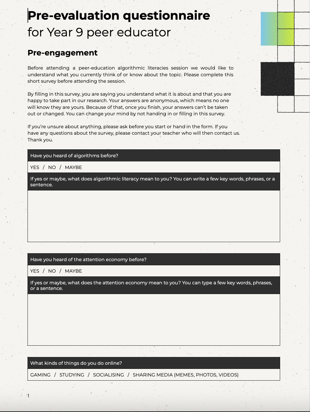
Drawing on the bold gradients, typography and graphic language developed for the animations, we worked with the team at ink to create a consistent identity that was carried across the workshop materials and report template.
We also supplied the team with a library of reusable assets, including graphics, patterns and design elements, enabling the client to apply the identity consistently in future resources and communications.
PROJECT REFLECTIONS
In conclusion.
From the earliest concept discussions through to delivering the final learning materials, this project was shaped by close collaboration and an iterative design process. Every creative decision - from the animation style and voiceover to the visual identity and sound design - was guided by a single goal: helping young people engage confidently with digital literacy in a way that felt approachable and genuinely interesting for them.
The result is a flexible toolkit that not only supports the existing mentoring programme but also provides the client with a lasting visual identity that can grow alongside future resources and be repurposed for future workshops.
“Fat Panda were great
They took time to understand the brief and the subject, they met every deadline whilst being flexible and adaptable and were a pleasure to work with.”
Dr Katharine Smales
Research Fellow, UCL
You might also like:
The Animation Process
We’ll take you through the entire process of creating an animation that will capture your viewer’s attention.
Case Study
Animation
IMSE - Imperial College London

Case Study
Animation
Grantham Institute on Climate Change and the Environment - Imperial College London