Case Study - Animation
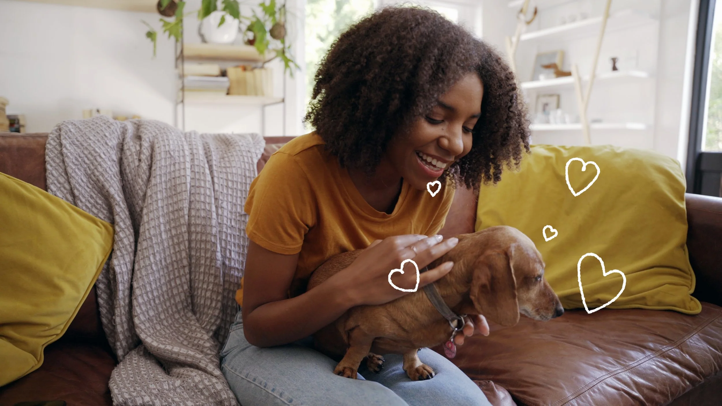
An animated campaign for the Grantham Institute for Climate Change focused on reducing pets’ environmental paw prints. Blending animation with live-action pet footage, the campaign was designed for print, digital and social platforms ahead of the Great Exhibition Road Festival 2026.
The brief:
This project followed on from a series of 90-second animations we produced a few years back to communicate the research findings of the Grantham Institute for Climate Change. Following the success of the original animations, the client invited us back to create the latest instalment in the series.
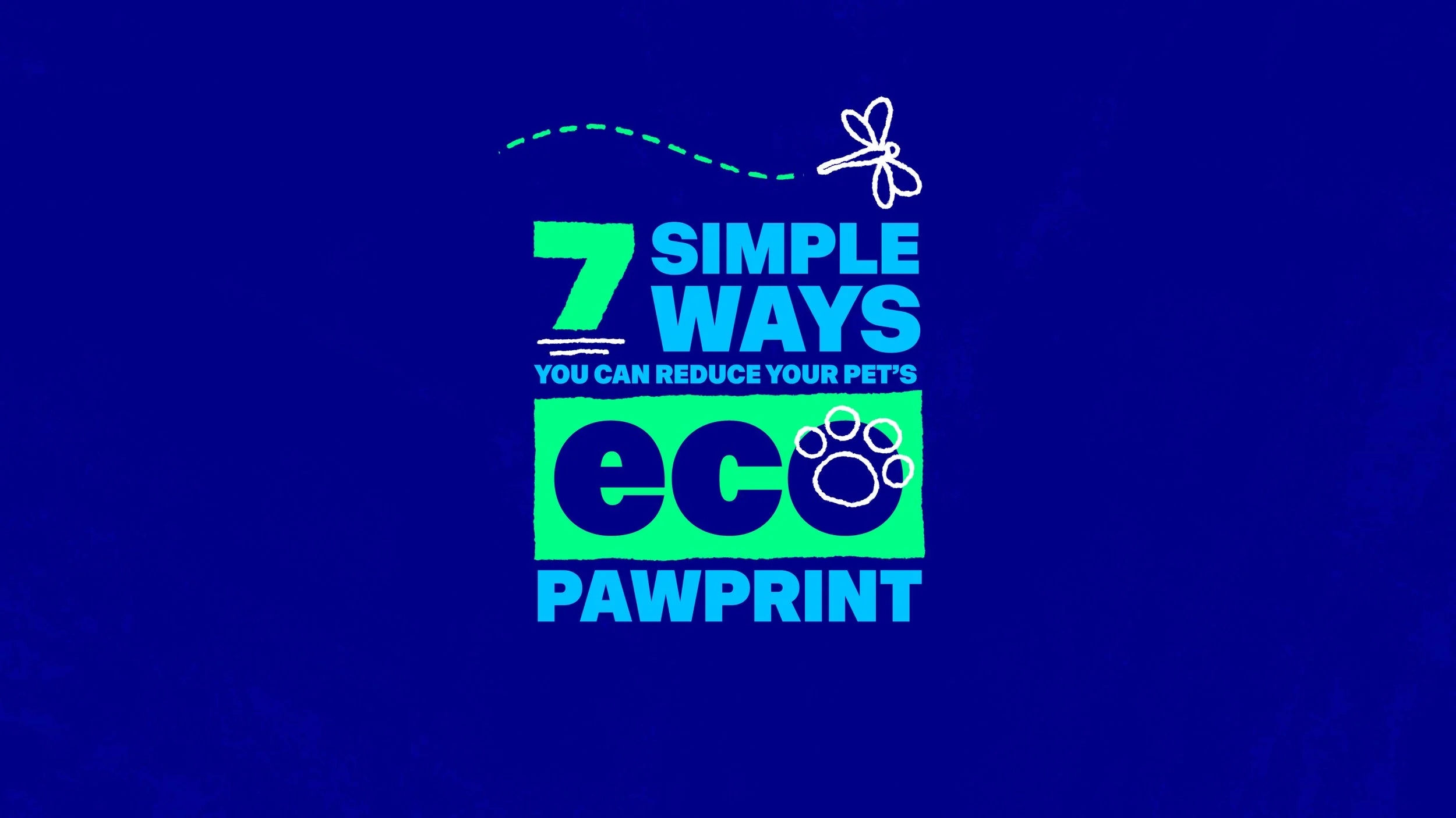
This iteration focused on the actions individuals can take to reduce their pet’s environmental paw print.
The production was timed to coincide with the Great Exhibition Road Festival, which took place on 6–7 June 2026, where the Grantham Institute hosted a stand to engage with festival-goers about the steps they can take to reduce their pet’s environmental paw print.
The client asked us to develop a design concept that could translate seamlessly across print, digital and social channels. A key creative consideration was how to blend animation with live-action imagery, allowing us to incorporate plenty of adorable pet footage - because who doesn’t love cute animal content?
Our approach.
The audience
As the materials produced for this project were intended to be shared at a public exhibition, they needed to appeal to a broad audience. It was assumed that visitors may have little or no prior knowledge of environmental issues, so the messaging needed to be accessible and easy to engage with.
The tone was designed to be informal and relatable, connecting with people in a way that felt approachable rather than expecting a high level of environmental awareness. The primary audience consisted of everyday pet owners who care about their animals and want to make responsible choices, but who may not have previously considered the environmental impact of pet ownership. The aim was to encourage awareness and positive action without being overly technical, judgmental, or overwhelming.
Based on the broad audience, we felt that it was important to produce a distinct visual language that felt warm and approachable, while remaining aligned with Imperial’s broader communications identity. The creative approach combined animation with stock imagery to create a visual style that was engaging, relatable, and accessible to a wide audience. This balance helped communicate environmental messages in a way that felt inviting and relevant, rather than feeling overly scientific.
We began the project with the animation, which allowed us to establish and refine the visual style before extending it across the leaflet and website assets.
Pre-production
We held an initial meeting with all stakeholders to review the details of each deliverable. During this session, we established key project deadlines and identified the dates by which each deliverable would need to be completed. In addition, we agreed on a communication plan and set a fixed weekly check-in to review progress and outstanding actions. Scheduling a dedicated time for regular catch-ups helped keep the project on track and ensured steady progress without
Script development
The script was primarily developed by the Grantham Institute communications team, with the wording evolving throughout the project.
We reviewed the script and identified opportunities for visual elements to effectively illustrate key points, reducing the need to state everything explicitly within the script. Early in the project, we recorded guide voiceovers, which helped us pinpoint areas where the flow could be improved, and we worked collaboratively with the Grantham team to enhance clarity and overall coherence.
Style exploration
The first step was to establish a visual direction by gathering a selection of references. These were not intended to be replicated directly, but rather to help define the tone, personality, and overall approach for the campaign. Sharing these examples with the project team also helped to ensure we were aligned on the project objectives and overall look and feel. A common thread that emerged from the references was the successful blend of animation and real-world imagery, creating content that felt both informative and approachable.
Drawing on the references provided in the brief, we curated a Pinterest mood board and developed three distinct visual directions for consideration:
Playful
Whimsical illustrations featuring soft pastel colours, organic shapes, rounded edges, and characterful typography. This approach felt friendly, accessible, and emotionally engaging.
Modernist
A clean and contemporary style built around geometric forms, structured layouts, bold colour palettes, and confident sans-serif typography. This direction offered clarity and credibility while maintaining a strong visual presence.
Doodle
Hand-drawn illustrations layered over photography and video content. This approach introduced personality, expression, and warmth while providing a flexible way to communicate information and guide attention within real-world scenes.
Each direction explored different ways of balancing accessibility, engagement, and trust, while supporting the project's goal of communicating environmental issues.
The team quickly aligned on the Doodle direction as the strongest option. It worked well with the project's use of stock photography and video, while requiring only a simple illustration system to add personality and visual consistency.
By layering hand-drawn graphics over real-world imagery, the style introduced warmth and character, helped highlight key information, and made a potentially sensitive topic feel more approachable and engaging

Illustration
The next stage, once the project team had approved the storyboard, was to begin developing the vector artwork in Adobe Illustrator. Again, by referring closely to the existing visual identity, we were able to develop a unique look and feel that gave the visual concepts life but appeared as if they ‘belonged’ with the rest of the Grantham Institute brand.
We established a flat illustrative style, which allowed us to convey a complex subject matter in a concise, digestible format and balance the necessary scientific detail with clear illustrated visuals.


Voiceover
During pre-production, we agreed that the voiceover narration, above all, should have the following characteristics:
Authoritative but warm;
Dynamic but calm;
Articulate but relatable.
After finding and providing several viable options we found voiceover artists to perform the scripts for the videos. In order to give clear directions on timings and pronunciation, we provided a guideline voiceover track. The briefing paper authors and research team were able to consult on the pronunciation on the more specialist language within the script.
Music and sound design
We opted for a whimsical style of music. One of the key phrases we searched for when looking on stock sites was ‘documentary’ music. We really wanted music that bubbled away nicely in the background without being too distracting.
We wanted the tracks to have quite serious undertones whilst retaining a ‘playful’ element. The length of the music tracks we acquired had to be edited in Adobe Audition in order to match the 90 second duration of the video.
The sound design bed was fairly minimal for both animated videos. Hyperrealistic foley was used to augment the on-screen visual elements. Sound design was created and then edited using Adobe Premiere using some minimal processing and effects in order to achieve an experience that felt hyperreal while, at the same time, very organic.

Motion design
Before even touching Adobe After Effects, for the animation part of production it was important we were 100% sure that the illustrated visual content worked within the context and timing of the voiceover. We therefore created a guide voiceover and animated to this before commissioning the professional narration.

Careful layering of artwork helped to streamline the motion design process. All files and comps would be appropriately structured to make the animation much easier and quicker to work with.
We took care at the animation stage to ensure all kinetic typography and character animation was smooth and fluid, each scene flowing effortlessly into the next with exaggerated easing adhering to Google's Material Design principals for speed and motion.
We were in regular contact with the commissioning team throughout this process to ensure our work was aligned with the client’s artistic vision. This helped to avoid any big surprises or amends at the end of production.
Final editing and subtitles
Adobe Premiere was used again at the end to bring all of the component parts together including the rendered animation, music, professional voiceover and sound design. Premiere gives us the opportunity to do one final check to make sure all component parts are working in harmony. This stage also provides a good opportunity to make any last minute tweaks.
There is an additional opportunity during this phase to produce the subtitles for the animation. Typically, clients will request versions both with and without subtitles with an accompanying .srt file for when videos are being uploaded to YouTube or social media.
Once that stage is complete, all that’s left is for us to send the final versions over to the client, making any final small tweaks if required. We usually find there aren’t too many amends at this stage, particularly if we have been in regular contact with project teams throughout production.

In conclusion:
This project provided ample opportunity to utilise our varied skills. Despite the relatively short turnaround of 3-4 weeks per animation, we were proud to have produced a series of portfolio-worthy animations that have led to us receiving more work from the client. The benefit of working closely with the client from the outset is that we now have an established style in place that will be easy to replicate for subsequent videos; also reducing lead times.

“We really enjoyed working with the team and are very happy with the finished product
The Fat Panda team provided a clear structure for developing our videos from conception to completion with lots of creative ideas along the way to help us communicate our key messages in a simple, yet engaging, manner.”
Dr Neil Jennings
Partnership Development Manager, Imperial College London
You might also like:
The Animation Process
We’ll take you through the entire process of creating an animation that will capture your viewer’s attention.
Case Study
Animation
IMSE - Imperial College London

Case Study
Video
University of Huddersfield - Graduation